Gerry Barney says updated branding, to be used by Great British Railways, uses too many colours
The designer of the familiar British Rail logo has warned against government plans to revamp the symbol and dismissed an attempt to give it a green makeover as a “load of old”.
The transport secretary, Grant Shapps, has said his plans for the new Great British Railways will involve “updated versions of the classic ‘double-arrow’ logo” when the system is launched next year. He has promised “a single familiar brand with a bold new vision for passengers – of punctual services, simpler tickets and a modern and green railway that meets the needs of the nation”.
The Rail Delivery Group (RDG) launched a campaign on Wednesday to underline the environmental benefits of train travel, featuring the traditional logo but coloured in four shades of green.
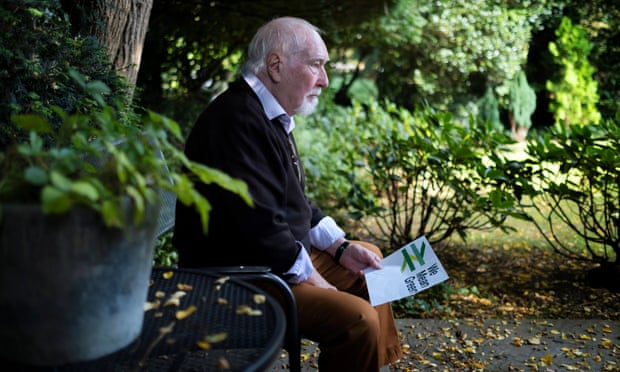
The group, which represents the industry, had wanted octogenarian designer of the original logo, Gerry Barney, to endorse the makeover. But when the Guardian showed him the recoloured version he was appalled.
“I think that’s rubbish,” he said. “I could understand it if they had just swapped red for green. But why on earth have they got that many colours? It’s a load of old
COVENTRY MESSAGE BOARD
News, discussion and entertainment for Coventry area dwellers past and present.
British Rail logo designer appalled by green makeover ‘mess’
1 post
• Page 1 of 1
British Rail logo designer appalled by green makeover ‘mess’
![]() by dutchman » Wed Sep 22, 2021 2:46 pm
by dutchman » Wed Sep 22, 2021 2:46 pm

-

dutchman - Site Admin
- Posts: 50482
- Joined: Fri Oct 23, 2009 1:24 am
- Location: Spon End
1 post
• Page 1 of 1
Who is online
Users browsing this forum: Google [Bot] and 4 guests
-
- Ads
Powered by phpBB® Forum Software © phpBB Group
